The style I"m using here is based on a popular new font, Carolyna. I've gotten lots of requests recently to do this script which is nice because I always have fun utilizing a wide variety of styles!
I
just completed these table name signs for a client. Since the pointed
pen can only make a line so thick, after doing the lettering with the
gold gouache, I went back in with my pen to make all the thick lines
thicker. The style is a variation of copperplate.
This invitation is another pretty one produced by Sugar Paper. The client had requested this style of calligraphy for their names and then later wanted to add a coordinating monogram. The bride, Rebecca, really wanted an interesting ampersand to help make their monogram unique. Using pointed pen, copperplate style, I was able to create something she was happy with. I always find it especially inspiring and exciting to design something totally new and customized for each invitation.
A friend and favorite client of mine, was asked to contribute a piece of fabric to be incorporated into the chuppah for an upcoming wedding. Janis came to me to letter this quote onto a handkerchief that she provided. It's fourteen inches square and very thin. I went to the art store to get fabric markers, but they didn't have the calligraphy tip that I wanted. I bought several pens and thankfully one of them worked without bleeding ~ the Marvy calligraphy marker. I sketched out the quote on tissue paper then using my light box, tautly taped the handkerchief over the layout and did my writing. I had to work fast to prevent any bleeding so it would have been better in the end to use a fabric marker. I'm just happy Janis liked it and hope the bride and groom do, too!
I just received these samples from Tova Glenn, designer and owner of Brighten My Day in Atlanta. She is such a pleasure to work with. I was excited to see my monogram design letterpressed on a note card, invitation and envelope lining. I've never seen a lining with letterpress ~ very pretty! Also in the photo is an insert that has a foil stamped monogram. So fun to see the monogram used in so many ways.
I sometimes have clients come to me with a request to copy fonts that are entirely non-calligraphic. Generally, I recommend that the addressing diverge from trying to mimic a font that is obviously not calligraphic/ hand lettered and that I do something that coordinates with the font but does not try to copy that font. I recently got a request for such and agreed to do it because the quantity was so small. Copying a type/font that is rigid, non- calligraphic is quite time consuming. Here is a sample of the lettering. Happily, the client was quite pleased with my lettering.
I
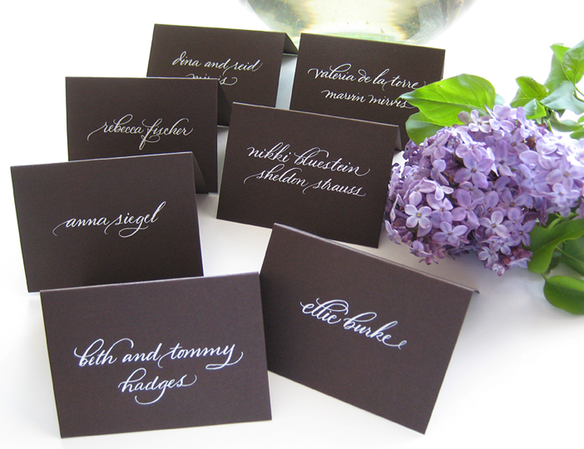
just finished these seating cards for a client. The font is Bickham
Script which has a vast array of alternate swash letters. It's really
fun to have the variety to choose from. And, I always love the way white lettering looks on chocolate brown!
I have had the pleasure of doing work several times for Tova Glenn of Brighten My Day , a wonderful invitation designer in Atlanta. She recently had a baby girl and requested I do calligraphy for her stationery. I see so much letterpress, which I love, but it was fun to see my lettering done in foil stamping. I particularly like the pink on pink!
Another beautifully designed invitation by Sugar Paper. For this one I was asked to provide the calligraphy for just the bride and groom's names and words to highlight the other two pieces. We also used just the initials of the couple for the return address and response envelope. I like the simplicity of this invitation suite and love the addition of the pink letterpress on the borders.
Here's a letter pressed invitation I did for the talented invitation designer, Tova Glenn of Brighten My Day . I had a lot of fun with the bride and groom's names on this one.
Monday, February 27, 2012
Wednesday night Vanity Fair, along with Anna Zegna and Colin Firth and his wife Livia, hosted a dinner at Chateau Marmont in West Hollywood. It was a fundraiser for Oxfam, an international organization that works in over 90 countries to end poverty and injustice.I was hired by Vanity Fair to personalize the menus with each guest's name. The style I used here is a variation of Spencerian calligraphy. In addition to calligraphing the menus, I was asked to be on site in case they needed any last minute changes or additions. The dinner for 50 people took place in one of the charming bungalows at the hotel.If you'd like to see a slide show of some of the guests, you can check it out here .
A new lettering design I did for Sugar Paper. I love that they used white letterpress on the kraft paper, plus who could resist the cute lining. Happy Valentine's Day to you!
I received a request from sweet Danielle in Texas to design her wedding invitation. She and Brian had seen a sample of my calligraphy that had been used for a Sugar Paper mailer. They also sent me a photo of a layout they really liked. Originally I had recommended doing the bottom right copy in a very simple type, but Danielle was in love with all the curves and swirls, so I did it all in calligraphy. Congrats to Danielle & Brian on their upcoming nuptials!
This was such a nice project to work on. First of all, Jennifer from Joie de Vivre is such a sweetheart to work with. And secondly, the story of the couple that I did the certificate for warms my heart. Apparently, Ed is 90 and Angie is in her 70's. They had both lost their spouses after being caregivers for about 10 years. Ed signed up for online dating and Angie's kids signed her up. That's how they found each other and fell in love.There are pencil lines for each of their wedding guests to sign the certificate.The script here is pointed pen and the body copy is italic.
I'm excited to show you a logo design I did for a new online magazine. I've been working with the lovely founder, Erica, and have seen the site develop into something quite wonderful. Sonoma Christian Home is up and running. There are some great articles, photos and recipes. Now it's time for me to design her business card. I'll keep you posted on how that goes!
What a beautiful setting for a wedding! I had the pleasure of doing the calligraphy for Amy and Brett's wedding. Today Amy let me know her wedding photos, done by Orchard Cove Photography, are featured on Style Me Pretty.Take a peek to see more gorgeous photos. Very exciting.
The font on the invitation is Bickham script, so I mixed up gouache paint to match the pretty blue and did the calligraphy style to match. On the chalkboard below, I also used Bickham. For that I used white acrylic paint to do the lettering.
And, I just love these three photos so I included them for you to see.
I'm so excited to share my very first digital font with you!It launched on myfonts.com on August 12th. I originally hand lettered the alphabet with a stick and sumi ink then scanned it into Fontographer and created the resulting digital font. This encourages me to come up with more complex and interesting fonts in the future!
A bride-to-be brought over this lovely, framed chalkboard for me to write on. I did the script using the white, chisel point chalk marker she supplied.
For several years now I've had the opportunity to work with Jessica Latham, the fabulous event manager at Vanity Fair. This year once again I calligraphed seating envelopes and place cards for their Academy Awards party. The place cards are actually booklets that contain the night's menu as well as all the nominees for the year. I had the pleasure of meeting Joan Allen who photographed the event. Joan provided me with the photos you see here.You can't see the calligraphy very well in the first photo, but I thought it was such a nice photo, I had to show you!
I really like how this invitation came out! Designed by Sugar Paper , I think it has just the right amount of playfulness and sparkle to set the mood for a Year's Eve wedding celebration. The foil stamped dots remind me of confetti. I was excited to have the opportunity to do a new, more contemporary variation of copperplate calligraphy.
With Valentine's Day just around the corner, Sugar Paper has created a very sweet line of cards just for the occasion. I'm happy to have my calligraphy incorporated into some of their great designs! Check them out on Sugar Paper's blog.
The girls at Sugar Paper showed me the lettering sample "Thinking of You"as inspiration. Anna Bond of Rifle Paper Co. created the card above.
Here's my twist on that style with "New York". It's a brand new lettering style for me. Because the lettering is actually drawn and built up rather than simply lettered with one pen nib, it's much more time consuming. Shown here is a proposed design for a moving announcement.
A new color combination on this invitation letterpress printed by Sugar Paper. I'm in the process of illustrating a map for the same client and will show it to you when it's completed.
I recently had the privilege of working on an event with some of the most talented people in the event business! Lisa Vorce of Oh, How Charming contacted me to do menus for an elopement she was designing. The photography is by Aaron Delesie and is absolutely gorgeous, that coupled with Mindy Rice's floral design the location, Figueroa Mountain Farmhouse , Barker Decor and Susan's announcement from Papel Paper and Press ...beautiful. Here's the link to Style Me Pretty, one of the sites featuring this lovely event. There, you will see a gallery of photos that will take your breath away!
Just having some fun with a decorative envelope to a friend. It was really nice to do some italic calligraphy which I don't do as often as copperplate.
Last month I did a trunk show with a couple of friends, and in addition to making some jewelry to sell, I made a handful of these 4x4 accordian books. The one above is one of my favorite covers. The only one I still have is the holiday book below with it's fuzzy polka dot cover paper and shiny gold writing inside.
Since copperplate, or some variation of pointed pen seems to be the most requested style, I rarely do italic calligraphy anymore. I really enjoyed doing it for this quote that has the floral cover.
The last thing I made for the show were these mini books about 1x1.5 and attached pin backs to them. These were the only things that didn't sell, but I think they're fun to wear.
And finally, I received a comment from Rena, who does wonderful whimsical illustrations, on my post for the trunk show saying that she would like to buy one of my 4x4 books. She told me her favorite quote and, as a surprise for her, I made this book and sent it to her. The cover here is much more a collage than the books I did for the show. I used papers, rubber stamps and gouache here. What fun to make and give a gift to someone I know appreciates my art!
I have 4 mini pins and the holiday book left. I'm giving them away to the first five people who comment : )