skip to main |
skip to sidebar

I did this for my friend
Judy and used one of her
favorite poems by Emily
Dickinson. The prominent
calligraphy is the most
known verse of the poem
but I also incorporated
verses two and three.
I used gouache, acrylics,
brushes, sponges and
calligraphy pens.

I don't think I've done my own card for several years now. I'm usually so busy with work this time of year that I don't make the time to do one. I was determined to make one this year! It's a letter pressed card. Best wishes to you for a wonderful holiday and happy, healthy new year!

This year I had fun using a couple of different envelopes. I love the polka dot, and the white on that deep red is a favorite of mine.


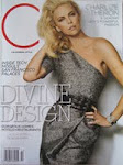
In C Magazine, my calligraphic monogram was featured on the "What's Hot" page! I designed and lettered it, and it was beautifully letterpressed by Sugar Paper.

A new card design by Sugar Paper with my calligraphy incorporated.

I did calligraphy for a mailer for Sugar Paper and they decided to blow it up to use for their Holiday window. It's always fun to see my work used for a variety of applications. The original size of the letters was about 1/4 inch in height.

Two samples of my first time painting and doing calligraphy on canvas. These are both going to be sent to other artists as part of an art exchange. I also created a mailing tag for the outside of the package and you can see that on my other blog here. I had a great time creating these!
 This is an example of the other portion of the job shown below. I think the embossed monogram on the insert card is really a nice touch.

These were just done for a client whose wedding is this weekend. It's always a bit challenging to do copperplate in a larger size like this (lower case letters about 5/8" high), since the thick lines require pressure on the nib to allow more ink to flow. I think they came out fairly well and I hope she likes them!

I just completed 12 of these menu chalkboards for a wedding this weekend in Napa Valley. I thought this was a clever way to designate the tables (each board has a different table name), as well as providing a menu for the guests. The wedding is being coordinated by Traci at
Napa Valley Celebrations. It's so beautiful in Napa, wish I was attending!

This sign will be placed next to the guest book to encourage people to leave good wishes in the book for the bride and groom. The script is in white acrylic paint, the leaves in green gouache and the block letters are done with white uni-ball pen.

I'm completing this job tonight for a client to pick up tomorrow. The typeface I'm mimicking is called Zaner. Generally you don't want lines crossing through other letters, but that's how the capitals are designed in this font. Envelope addressing can be tedious, but I'm really enjoying this one. The combination of the script and the white on the red is really nice!
 I just completed a big job this week for an event Van Cleef and Arpels held at a private estate in Malibu. It was to launch a new line of one of a kind jewelry. I did place cards, seating cards and description cards for the jewelry. I was also hired to be on site for last minute calligraphy. I tried to trade my work for a pair of earrings, but they didn't go for it!
 All put together with a bit of ribbon on the binder ring.
 I put the the pages together with the cover using a binder ring.

These little 3 x 3 pages are going into a book I'm donating to the Society for Calligraphy. They are doing a silent auction at their 35th anniversary party.

My client liked the lettering and design of the card but I will probably change the figure silhouette to one that shows a pose that is more common for pilates.

I just completed this job for my client to give to her sister, the bride to be. The ink is a sort olive gouache with a metallic gold added. She was very happy with it!

In an effort to come up with some new menu ideas, I used a stick to quickly letter the first example, then a brush for the second one.

I did the calligraphy and layout for this menu for a client of Mindy Weiss .
It is a variation on copperplate calligraphy.

I was hired to do this menu board for a coffee house in Thousand Oaks. It was my first time doing a menu board. I started out using regular chalk, but I had no control over such a crude tool! Then I found out about chalk markers. The layout was a bit tricky, but once that was done I had a great time doing the fun lettering!
 I had fun playing
with the flourishes
on this card to create
one cohesive shape.
I chose a highly
textured paper making
it that much harder
to do!

My brother, Jeff Holtzman
designed this poster for
an event in Seattle and hired
me to do the lettering for it.
 This was a fun project to create a design with lettering to use on a coffee cup.
 Here's an example of how beautiful white gouache can look on a strong colored envelope. And, this is one of many ways to vary copperplate script.

This is a drawn capital letter in copperplate style. I first drew it, then did the illustration around it, leaving the B the white of the paper.

I was asked to do this style of writing for the Sugar Paper holiday mailing this year. I've not really done a layout like this with the flourishes extending off the card. The "kindly deliver to" was pressed in white on the face of the envelope with the addressee below.I love the way it came out in letterpress!
 And, this was a smaller enclosure card included with the Sugar Paper holiday mailer

I recently took a class on gestural writing from the wonderful and talented Yves Leterme.
This style of writing has a different flow and energy than what I usually do. It's hard but fun and I'm going to keep practicing!
 This is a pretty good collection of the styles I do regularly. I also thoroughly enjoy creating new fonts for specific and unique applications.

I just completed this piece for a client to give to his wife for their first anniversary. The layout, colors and styles were done at his request. Happy Anniversary!
 This is a new birth announcement designed by Sugar Paper incorporating my calligraphy. I really think their design aesthetic is lovely.

I just received this photo from my client Lucy. She wanted to show me how the envelopes I had calligraphed for her and her fiance Matt looked with the vintage postage they chose to use. They selected stamps that relate in some way specifically to each invitee. Great idea and I love the way they look with the Rook style calligraphy.
-1.jpg)
This is an invitation I did that is a variation on copperplate script.

This set of wedding vows was another gift a client was giving to his wife for their anniversary. I call this calligraphy "Antique" Italic. I added the watercolor of Ravello lemons at the top as a nod to the couples visit there.


-1.jpg)


